
Case Study: Sister Afia’s Kitchen


Bold Design for a Bold Brand
My Role
UI Designer · Visual Designer · Layout Strategist
Goal
Design a vibrant, mobile-friendly poster for Sister Afia’s Kitchen that quickly communicates catering services and drives customer orders.
Key Design Decisions
Visual Hierarchy: Headline → Services → Dishes → CTA
Guided users using Hick’s Law (fewer options) and Fitts’s Law (large, clear buttons).Color & Emotion:
Warm oranges, browns, and reds create a bold, appetizing tone. CTA uses Von Restorff Effect to stand out.Typography & Structure:
Mixed friendly script and sans-serif fonts for cultural tone and readability. Content grouped using the Law of Common Region.Imagery:
Rich, real food images arranged diagonally to highlight the menu and energize the layout.
UX Laws Used
Hick’s Law – Simplified choices
Fitts’s Law – Tappable CTA
Von Restorff Effect – Visual standout
Law of Common Region – Clear content groups
Serial Position Effect – Top dishes first and last
Outcome
The design boosted audience engagement via social sharing and increased catering inquiries. Clear structure and cultural tone helped the brand stand out while keeping info digestible and actionable.

Case Study: Danbeacha African Market
Bold Design Rooted in Culture
My Role
UI Designer · Visual Brand Stylist
Goal
Design a vibrant, culturally recognizable flyer to showcase key African grocery items and encourage store visits.
Design Highlights
Bold Typography: "African Grocery Shop" enlarged for instant recognition and Von Restorff Effect.
Product Imagery: Grouped familiar items (Milo, FanIce, Fufu) to create cultural familiarity using Law of Common Region.
Color Scheme: Deep blue for trust, red for emphasis and energy.
Layout Flow: Logo → Headline → Tagline → Product Visuals → Food List → Contact & Location (guided by Visual Hierarchy).
Outcome
The flyer delivers a clear, eye-catching message and culturally resonant branding — ideal for social sharing and in-store promotion.

Case Study: Handyman Home Services
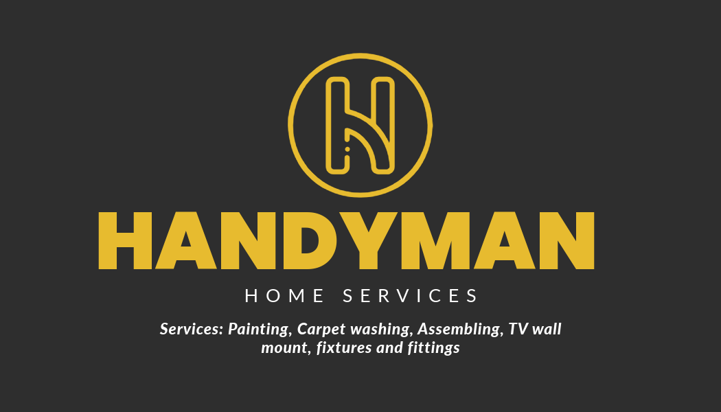

Bold, Clean, and Straight to the Job
Role
UI Designer · Visual Branding · Print Design
Objective
Design a trustworthy and professional identity for a handyman service offering general home repairs and fittings in Leeds. The materials needed to clearly communicate services while remaining visually impactful across digital and print.
Design Breakdown
Bold Yellow & Black Palette: Inspired by caution signs and tools—instantly conveys industry and reliability.
Typography Hierarchy: Strong “HANDYMAN” title grabs attention (Von Restorff Effect), paired with minimal sans-serif fonts for legibility.
Iconic Monogram Logo (H): Designed for instant recognition and branding versatility.
Balanced Layouts: Grid-aligned flyer and business card layouts follow Law of Proximity and Fitts’s Law, guiding users to key info like services and contact.
Service List Visual: Checkpoints and spacing improve scannability and trust.
Outcome
The cohesive identity builds trust at a glance and makes it easy for customers to understand services and reach out. The brand is now used across physical flyers, social media, and quotation cards.