Barclays App UX Redesign Case Study
Improving the Payments Experience for Simplicity & Speed
Year
2025
Role
UX Designer
Redesign key flows in the Barclays mobile app, focusing on improving the homepage, payments and service experience.
The goal was to make it simpler, faster, and easier for users to complete essential banking tasks like sending money or depositing cheques.
KEY GOALS
KEY GOALS

Research & Inspiration
Reviews
“Don’t even try to deposit cheques: Life’s too short.”
Customer 1

“Remains intrusive and ineffective. Very unresponsive and difficult to use. Cluttered with difficult to navigate”
Customer 2

“What a vile app to work with. No support for copy and pasting account numbers or 2FA codes.”
Customer 3


“it needs more user-friendly labels for simple tasks such as making payments or view statements.”
Customer 4

“Slow with almost nonexistent online chat support.”
Customer 5
I began by analyzing common pain points from user reviews and comparing the Barclays experience with competitors like Monzo and Revolut.
Key Findings:
Users felt overwhelmed by Barclays' interface
Cheque deposits felt buried and confusing
Competitors used clearer icons, progress states, and success feedback
I created idea sketches and mapped out improvements to:
- Homepage navigation
- Payment and transfer flows
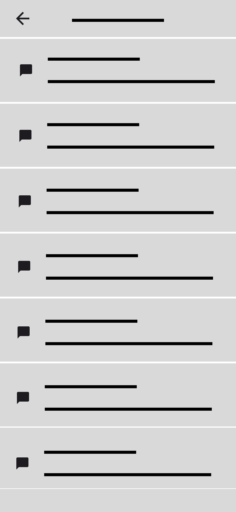
- Chat and Community Forum flows
- Cheque deposit UX

Low Fidelity
Wireframes
Low Fidelity
Based on my research, I sketched and designed low-fidelity wireframes to explore layout and flow. Each screen was designed with simplicity and clarity in mind.


Simplified Chat system with an introduction of a forum


Tab-based navigation for faster access to essential services (Payments, statements and savings)


Clear payment tabs and clear feedback after transactions


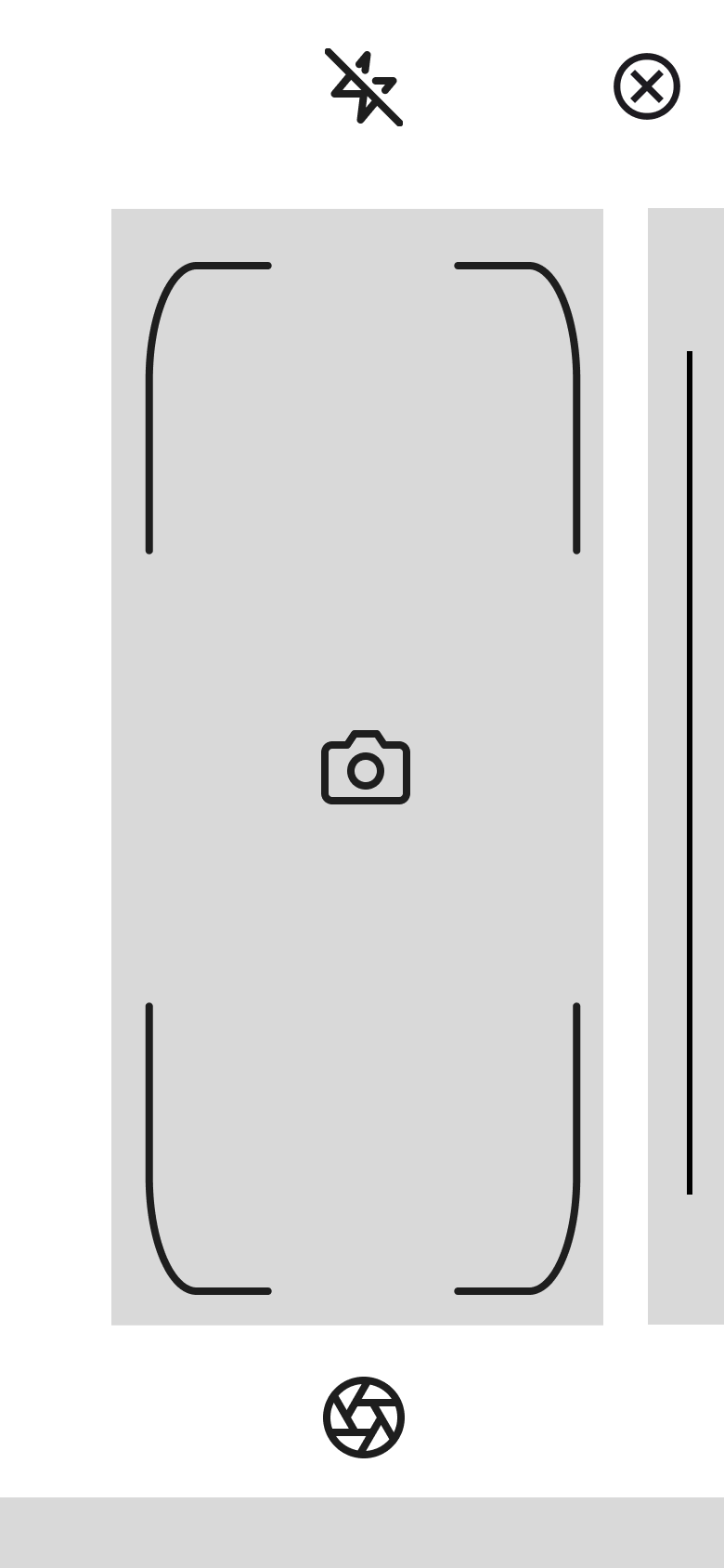
Shutter button and a capture frame to make cheque deposits a breeze
Key UX Changes
Tab-based navigation for faster access to essentials
Simplified cheque deposit capture
Clear feedback after transactions

BEFORE

AFTER
Brand
•
Identity
•
Brand • Identity •


Now the Moment you’ve been waiting for….
Final UI Designs


Outcome
Improve visuals
Improved visual hierarchy and spacing for easy navigation to essential services such as statements, payment and recent transactions.
Clear and Quick
Make payment and cheque deposit flows clearer and quicker
Branding
Practiced applying brand systems within strict UX constraints.
Reflections & Next steps
Testing
Run usability testing sessions on a grand scale to analyse the improvement in the user experience.
Accessibility
Explore more accessibility improvements, especially for vulnerable customers who often use the app.
More Features
Add features like AI integrations for queries and savings goals and a deep dive into the savings sliders
Link to prototype
"Creativity is seeing what others see and thinking what no one else ever thought."
– Albert Einstein


